ALI SEDAIF, PORTFOLIO
ALI
SEDAIFselected works
Design must speak the language of its people — but with a voice that challenges the status quo.
Design Philosophy
A deliberate fusion of Western structural discipline and Eastern cultural soul — balancing the precision of Braun's golden era with the vibrant, expressive maximalism of the East.
Cultural Authenticity
Design must resemble the culture it serves, acting as a mirror to its surroundings while pushing boundaries.
Functional Radicalism
Influenced by the heritage of functionalism, design must work perfectly — but it must also contain a radical spark that provokes thought.
Structural Soul
Using the grid as a foundation, I leave room for the human and oriental spirit to breathe — a balance between order and emotion.
I am deeply influenced by the Bauhaus movement, the "less is more" minimalist ethos, and the rigorous grid systems of Swiss design. But I believe design shouldn't be a cold import; it must be adapted and tamed to fit our unique context. I am a devotee of 1970s, 80s, and 90s aesthetics, finding endless inspiration in the tactile world of print — a visual language shaped by the work of Saul Bass, Ikko Tanaka, and Paula Scher.
My philosophy in life is inherently radical. Coming from a background in engineering, I've learned to blend logical systems with a radical creative spirit. I am a designer who refuses to stay in one box — here to learn, to challenge the status quo, and to eventually build a creative legacy that is as unpredictable and authentic as my own journey.
Susan Kare
The woman who gave the computer a smile — a brand study in pixel-grid humanism.
The Premise
Susan Kare is the legendary graphic designer who created the first icons and typefaces for the Apple Macintosh in 1984. Known as the pioneer of pixel art, she transformed a cold machine into a friendly, human experience using nothing but limited grids. This project translates her foundational principles — simplicity, clarity, and humanity — into a contemporary brand system spanning two marks: the SK monogram and the Sumerian Bull for a fictional identity, Kare Restaurant.
Guiding Principles
Full Brand System

Prisms Over Amman
An ambient-media campaign for a fictional Pink Floyd concert — built to jolt a city and leave a memory.

The Brief, Interpreted
I chose to create an ambient-media campaign for a fictional Pink Floyd concert in Amman. I selected this approach because I wanted to jolt the city and generate buzz — and because I appreciated the freedom in the brief. The project focuses on immersive visuals, symbolic imagery, and experimental layouts to build anticipation and create a strong cultural impact.
Goals & Objectives
Build Awareness
Let people know that Pink Floyd is coming to Amman.
Create Curiosity
Shock and surprise the city so people talk and share.
Reflect the Spirit
Bring out Pink Floyd's psychedelic visual language.
Engage Real Spaces
Activate the public in physical, lived environments.
Cultural Impact
Leave visuals Amman remembers long after the event.
Research & Discovery
Pink Floyd, formed in London in 1965, became one of the first British psychedelic groups — distinguished by extended compositions, sonic experiments, philosophical lyrics, and elaborate live performances. Across The Dark Side of the Moon, Wish You Were Here, Animals, and The Wall, they built a body of work that treated the album cover as a cultural object rather than a portrait.
When we talk about marketing in rock music, Pink Floyd are one of the strangest cases. Most bands of the era put smiling faces on their covers to sell the personality of the musicians. Pink Floyd did the opposite — they hid behind symbols, surreal art, and strange photography. Working with the design group Hipgnosis (Storm Thorgerson and Aubrey "Po" Powell), they produced a prism, a wall, a flying pig, two heads in a field — icons that still circulate today, even among people who have never heard the music.
A prism. A wall. A pig. Each image still circulates today — proof that art direction can be more powerful than showing the artist's face.

Keywords
Target Audience
Older fans, 35–55. Men and women already connected with Pink Floyd, drawn by nostalgia.
Students & young adults, 18–30. A new generation discovering the band through its visual mythology.
Conceptualization & Ideation
At the beginning, I considered building the project around a generic rock band. As I learned more about Pink Floyd, I was drawn to their artistic direction — mostly symbols and psychedelic imagery — a style I'd long been interested in. My first instinct was a flying object over one of Amman's towers, since the band is famous for them.
I attempted a fully psychedelic poster first, but it consumed too much time and didn't resolve the way I wanted. I kept those attempts in the process book deliberately — the failed directions are part of the record. When I changed course, I simplified, and chose the prism as the single artistic direction for the whole campaign. It represents the band most clearly, it's instantly familiar, and it let me unify every touchpoint under one symbol.
Final Design Solutions
The prism anchors every element so people connect the campaign together. The typeface is the closest available to the band's original lettering. I added the shadow of the flying pig — a recurring Pink Floyd icon across albums and concerts — using it as a symbol that deliberately challenges the traditional meaning of the pig in the Middle East.
Ambient Media — Abdali Tower
I chose Abdali Tower because it's one of the most modern and busy places in Amman. Projecting the prism onto this tower makes the symbol highly visible, and the contrast between a classic Pink Floyd icon and a local landmark makes the campaign more memorable. Because the band is famous for flying objects, I placed their iconic pig above the site — to create controversy, push the news to cover it, and draw people to Abdali Boulevard simply to see what was happening.

One symbol, doing all the talking.

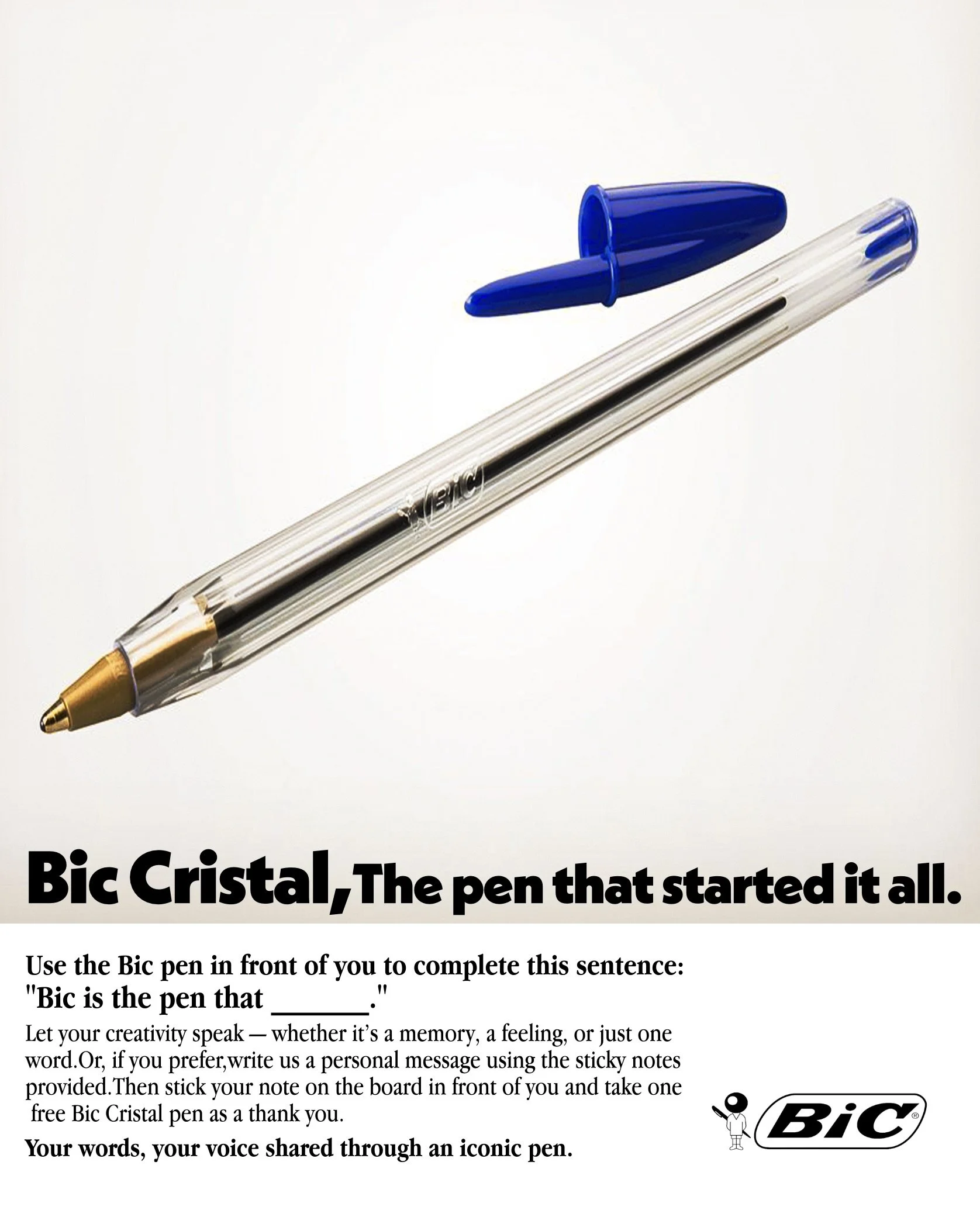
A Pen With a Point
A campaign for the everyday BIC pen — finding the sharp idea hiding inside an ordinary object.
The Idea
The humblest tool on any desk still does something profound: it makes a mark, holds a thought, and gives an idea a point. This campaign treats the BIC pen not as a product to be sold on features, but as a small instrument of expression — turning an everyday object into a statement about writing, voice, and the power of a single line.

Poster Series
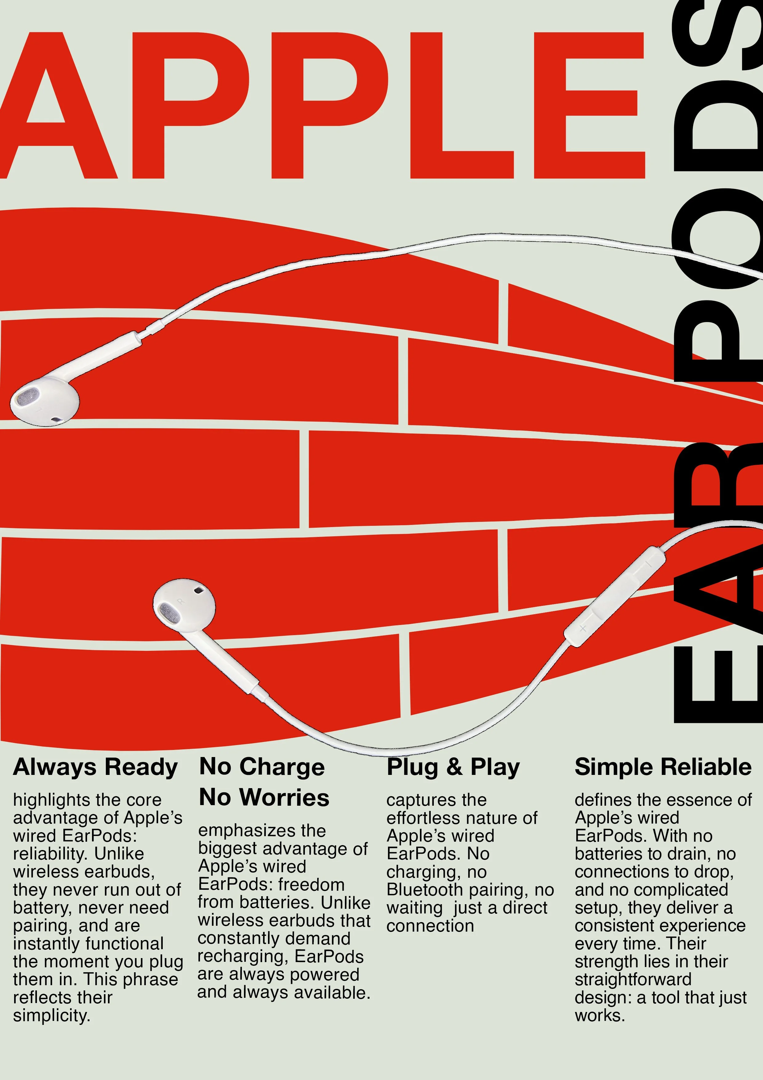
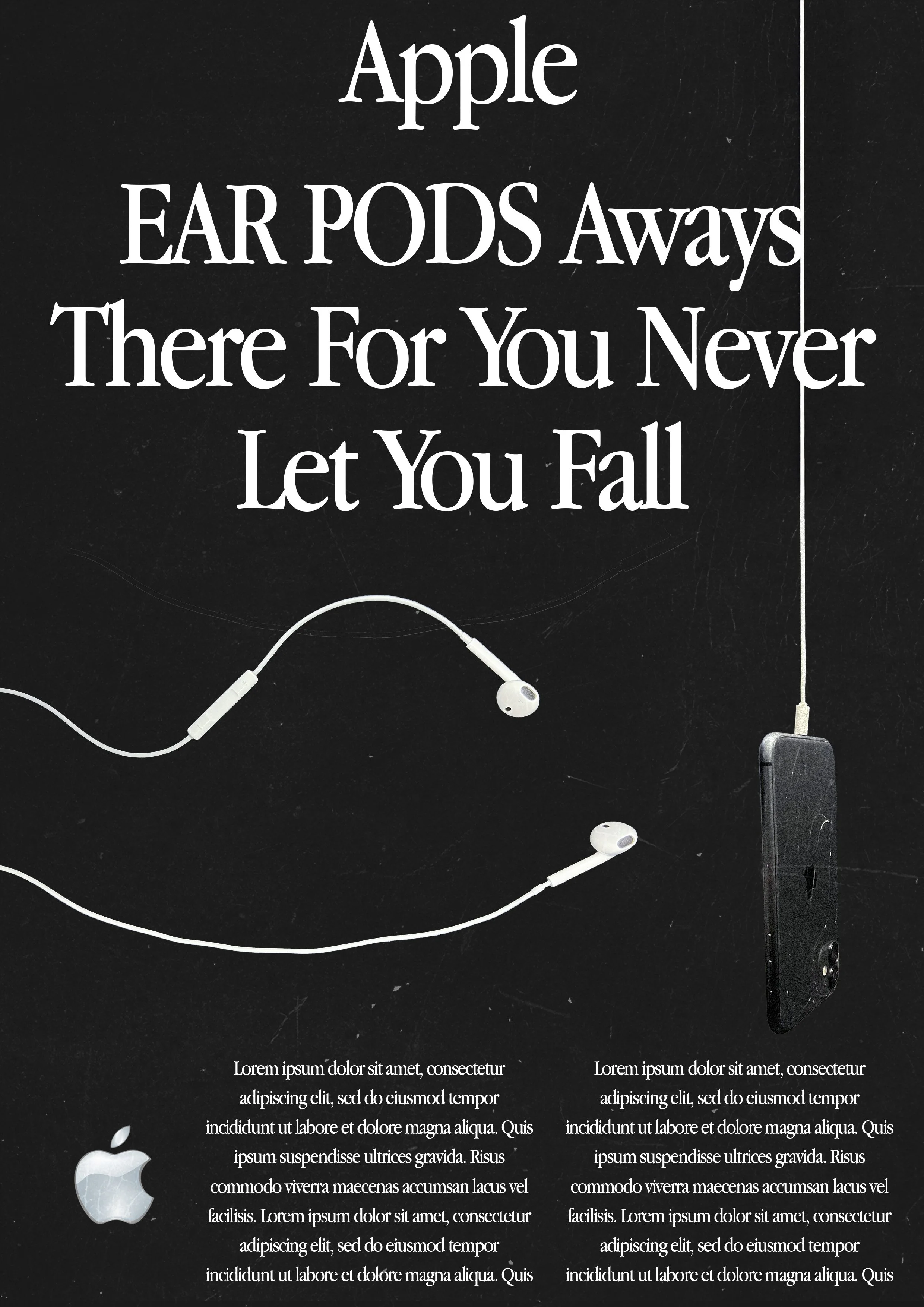
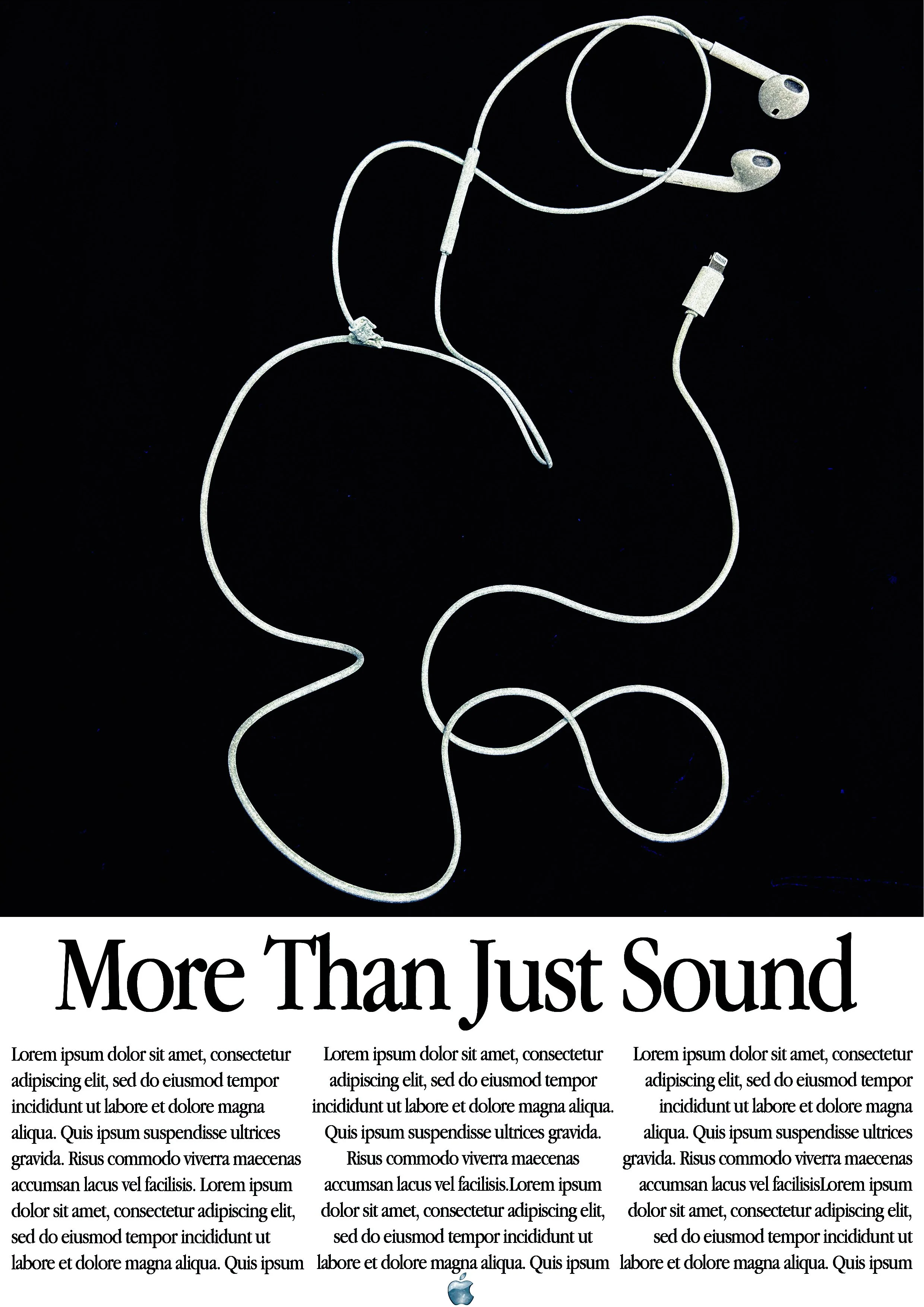
A set of three posters — composition, type, and image working as one.
Overview
A three-part poster series exploring composition, hierarchy, and visual impact. Each poster stands on its own while sharing a consistent design language across the set.
Field Notes
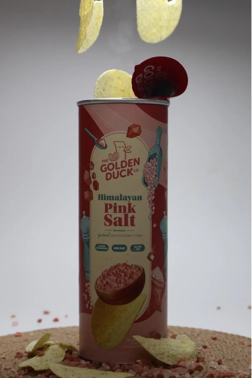
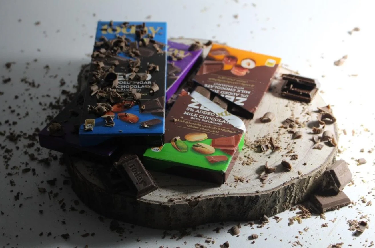
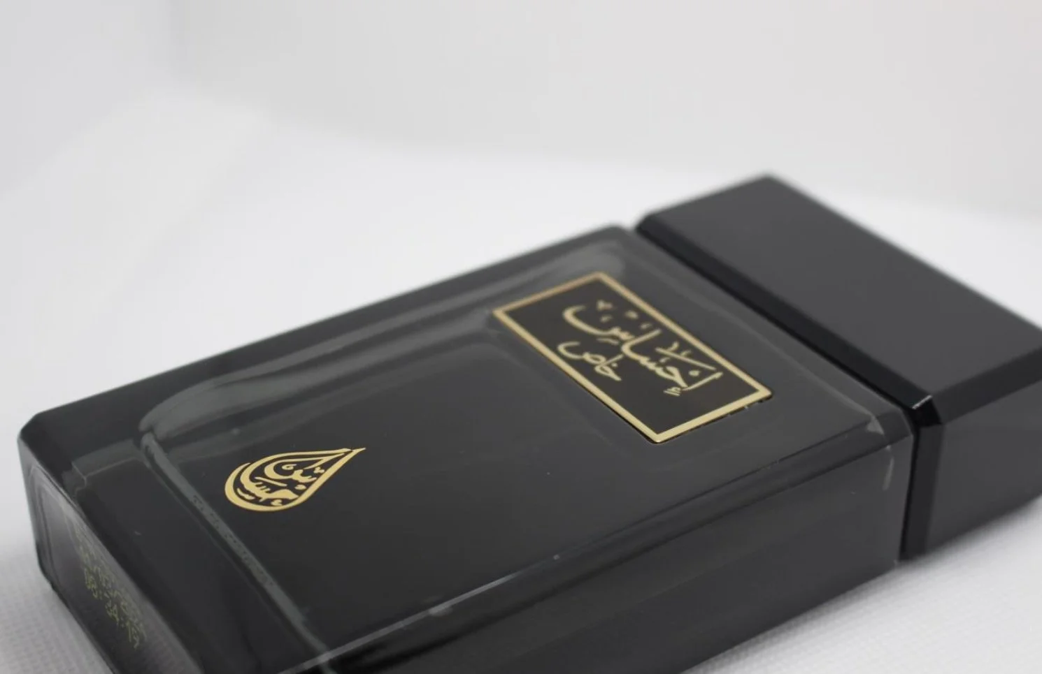
Photographs from the wander — seeking the raw, authentic pulse of the streets, away from the crowded landmarks.
My greatest passion is traveling — not as a tourist, but as a wanderer seeking the "true community." I intentionally avoid crowded landmarks to find the raw, authentic pulse of the streets.



Book Club
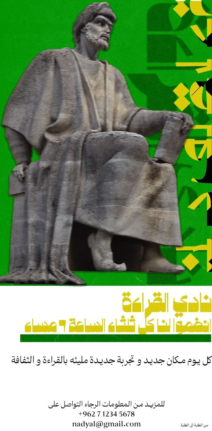
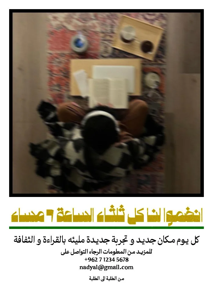
An identity for readers — built around the quiet ritual of gathering over pages.
Overview
A visual identity and collateral system for a book club — a project about community, reading culture, and the objects that bring people together around stories. The system carries the same research-driven, culturally-grounded approach across every touchpoint.


Teaching Philosophy
Education at its best is not about filling the student with information — it is about igniting a passion for learning that lasts a lifetime.
I believe meaningful learning in design is a partnership between the student and the institution; neither side can succeed alone. Design is not a set of facts to be memorized, but a discipline built through curiosity, observation, and continuous practice. As a student, I see my role as an active one — to question, to research, to sketch, to fail, and to try again.
My philosophy rests on three principles: curiosity that drives research, humility that welcomes feedback, and discipline that transforms ideas into refined work.